Monday, 24 February 2014

Bird Designs

Well, the love interest in my film is a cuckoo from a cuckoo clock. Needless to say, having spent so much time drawing my mouse lately, it's hard to find a good design for his other half; nothing's good enough for him!


I'm generally basing the design off a canary; cuckoo clock birds are songbirds, not necessarily cuckoos! The clock shop is going to be dark and moody so I'm going to offset that with a stunningly bright and lovely yellow bird!


It's surprising how many different variations you can find within the limited constraints, but there you go. It's time to put her next to my mouse to see how they look together.


Monday, 17 February 2014

Character Design and Colour Studies

This week has been spent mostly searching for a visual style for my film in character, environment and colour design. Below are a selection of pre-production pages that I've been working on this week to give you an idea of what's going on!


In the design of the mouse, I don't want him to be too cartoony as he needs to portray some serious emotions and that style simply would not fit. With that in mind, I'm keeping to fairly realistic anatomy and body proportions. He needs an expressive face to convey his emotions to the audience however, so facially he cannot be super-realistic. Instead, I'm going with very simple dot-like eyes and small eyebrows; they are easy to emote with and don't make the character too human or too cartoony.


Overall I had preferred the idea of brown fur for this little guy as it seemed warmer and more fit for a 'hero' character. Putting him into the context of the environment however, it's clear that he stands out much more if he has grey fur.


I have also been playing with colour schemes for the environment. I want to use colour to add to the emotions of each scene and with that in mind warmer, happier scenes will be red-yellow tinted whereas colder, more frightening scenes will be darkened to a blue.


Having decided on a colour scheme, that still left the background style. The previous images had a very sterile, digital feel to them and the above crayon-coloured thumbnails don't have the same weight of atmosphere. The painted-over-pencil thumbnails however seem to convey exactly what I want; the weight of atmosphere combined with the organic texture of pencils.

Monday, 10 February 2014

Background Value Studies

Over the weekend, I did a lot of value studies of backgrounds for my film in an attempt to work out an atmosphere and to make every shot count towards the story - 90 seconds is a very short amount of time!


These thumbnails are out of order so they won't spoil anything for you. I will give a little background though; a mouse enters a clockmaker's shop to shelter from the cold outside and finds himself falling in love with a cuckoo from a cuckoo clock. To say more may spoil the story so you go on and keep guessing!


Monday, 3 February 2014

Major Project

This week marks the start of the creation of our 2nd year films. The main character in my film is a mouse and so I've been doing mouse studies this week; anatomy, colour and style have been the focuses.


Monday, 27 January 2014

Botanical Gardens

At the beginning of December I was asked by a friend to do a painting based on a place in Sheffield. Having looked at lots of cityscape photographs and having a go at doing some 'urban painting', I realised that the style is just not me. Instead, I painted her the Botanical Gardens.


The last time I went to these gardens I was seven, so I had to use some photo reference. I had great fun experimenting with painting styles on the trees.

Monday, 20 January 2014

Rough Animation

I thought today I'd post the character animation piece I shared the pre-production work for a little while back. You can see that pre-production process here. The project was to take a child's drawing of a character and their chosen 11 second sound clip (taken from the 11 Second Club) and animate the character to the sound clip. I hope you enjoy my rough animation!


Monday, 13 January 2014

The Creative License

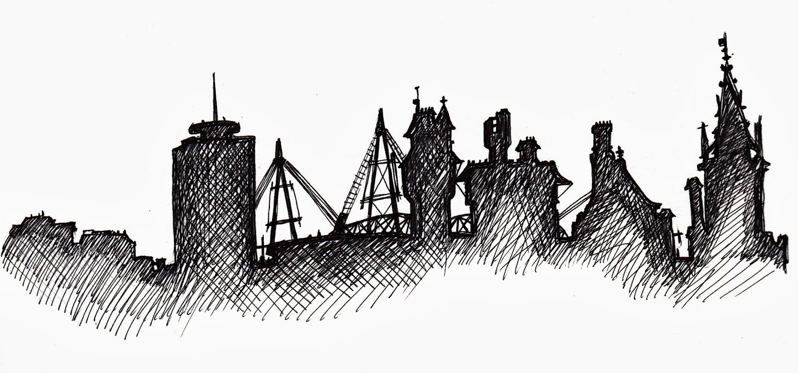
Cardiff skyline as seen from on top of the fort inside Cardiff Castle.

At the beginning of last term I was in a creative slump. It was when I was in the library waiting for a friend, mindlessly reading the spines of books on the 'creative' shelf when I came across an bright yellow spine that proclaimed in design-messy writing, 'The Creative License: Giving Yourself Permission to be the Artist you Truly Are'.

The author, Danny Gregory, suggests keeping an illustrated journal to celebrate your day-to-day life and to encourage seeing the beauty in everything. He puts forward the idea of not just drawing 'an apple' or 'the door', but drawing YOUR apple and YOUR door. No other apple/door will look as this one does in this moment - their individuality makes them special and worthy of being drawn and being art.

Journal page from the 15th October. Drawn at Cardiff Castle.

Since starting the book, I have been doing exactly as it suggests and keeping an illustrated journal. Not only that but doing it in pen as well. Pen is not my medium of choice (I'm a graphite-and-charcoal kinda girl) but despite my preconceptions about drawing in pen and the terror of making mistakes that can't be erased, it's actually incredibly liberating. With other media, you can rub out mistakes as often as need be, striving towards 'perfection'. With pen, every mistake stays and there is no going back and the drawing then has intrinsic energy - the lack of perfection gives it life!

The fort inside Cardiff Castle. 


I really recommend the book 'The Creative License' to everyone. You can buy it here on Amazon. Also check out Danny Gregory's blog here. It's very inspirational!