Monday, 30 December 2013

Skwigly: Online Animation Magazine


As some of you may know, I was asked by the lovely Ben Mitchell (Skwigly-man, animator and author of the fantastic graphic novel Throat) to make an 'Un-Advent' banner for the Skwigly site just for the 27th. Here it is! You can also check it out on the Skwigly site. Those of you who have been following my blog will know that I don't normally promote things but today will be an exception; you really need to hear about Skwigly!

For those of you unfamiliar with Skwigly, it's an online magazine for animators; "We love animation; love seeing animation, hearing about animation, talking about animation and showcasing animation." Based in the UK, it covers news, interviews, reviews, podcasts, videos, tutorials and on top of all that has a very strong community. On Mondays, promote your work using the tag #skwiglyselfpromotions and join in on Tuesdays with 'Chatty Tuesdays' at 9pm GMT; register to meet and chat with other animators!

This has been a great year for Skwigly, with December as the icing on the proverbial cake! They've been running an advent calendar and advent animation showcase; I've discovered so many great animators and animations this month that I'd never heard of before! Watch their interview with Joanna Quinn about the making of the BAF trailer and check out their latest podcast, featuring:
  • Richard Williams; animation legend of 'Who Framed Roger Rabbit' and 'The Animator’s Survival Kit' fame.
  • Ian Mackinnon and Peter Saunders; recent recipients of the BAF Lifetime Achievement Award and craftsmen behind the puppetry of 'The Corpse Bride', 'Frankenweenie' and 'Fantastic Mr. Fox'.
  • Animation historian, author and Cartoon Brew co-founder Jerry Beck, currently running Cartoon Research and Animation Scoop.
  • Chris Buck and Jennifer Lee, directors of Disney’s latest holiday feature 'Frozen'.
Well that's enough pushing from me. Please go check out Skwigly and follow them on Facebook and  Twitter for all the latest! I'll leave you in peace now with another idea I had for the banner.


Monday, 23 December 2013

Advent Lion

Another in my series of drawings based on advent chocolates. He's the king of the table! He's also the first drawing I've finished with my shiny new graphics tablet!


Almost Christmas!

Monday, 16 December 2013

Holiday Snowmen

Another painting for you all based on two advent chocolates that I've had - two snowmen with brooms. A little bit more relevant this time!


Just like these snowmen, I hope you all have a happy Christmas with your friends and families!

Monday, 9 December 2013

Almost Christmas!

My advent calendar chocolates this year have really bizarre images on them, so I decided I'd do some paintings based on them! On the 2nd December, my calendar chocolate showed a fish, not a fish as in the Christian symbol, I'm talking a realistic fish! This painting is my attempt to make a fish relevant to christmas and I hope you like it!


On Thursday afternoon, Jake (one of the lovely 3rd years) generously gave us a flash tutorial so that over the Christmas break we can practice our flash character animation. Hopefully you'll be seeing some of that work in weeks to come.

Monday, 2 December 2013

Illustrator Backgrounds

A follow-up from last week's Photoshop backgrounds, this week was the first time I've ever created anything other than graphics and text in Adobe Illustrator and I'm pretty pleased with the result! I am really falling in love with making backgrounds!


I'm 99% sure that my major project this year will be a two-minute film about a mouse in a clockmaker's shop and so I used this project as an experiment in style for that film. Below is the background with an incredibly quickly-made mouse to give you an idea of the 'mouse-eye' perspective that I'll be using.


Monday, 25 November 2013

Animation Backgrounds in Photoshop

This week I have been colouring backgrounds for animation in Photoshop. Photoshop is certainly not new to me but the method that we were using was entirely novel and I'm glad to know it as it's the industry standard way of working that allows for a style to be followed.

The line-art of these backgrounds was taken from the children's TV program, 'Frankenstein's Cat' by 'A Productions'. The aim of the exercise was to copy the style of the production as when we're not making our own independent films, we'll need to be able to follow someone else's style! 'A Productions' have a blog that they update with behind the scenes of all stages of the animation process, including their character and background development work. You can check it out here.

My final coloured backgrounds:


Monday, 18 November 2013

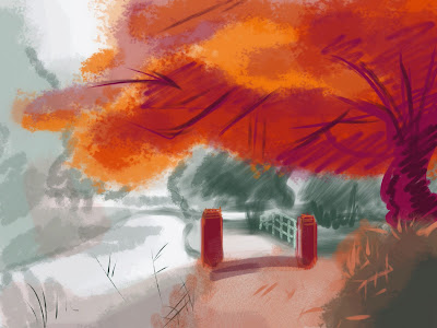
Speed Painting

I've discovered in the last two weeks how much I really love background painting - something I never expected as I normally concentrate on characters! With Photoshop, Illustrator and Procreate, I've been having a marvellous time!

I am posting a selection of the speed paintings I've done over the last two weeks. Each took 20-30 minutes to complete and were done from photo reference. The aim was to study colour, texture and atmosphere and I'm pretty pleased with the results! Speed painting is an incredibly theraputic thing to do so I wouldn't be surprised if you see more of these on my blog.


Photo references used: Misty SwampEvening Sky


Photo references used: Misty WoodlandWithered


Photo reference used: Melancholy


Photo reference used: Transformation

Monday, 11 November 2013

Pre-Production for Character Animation

At the start of our just-finished project, we were given a child's drawing of a character each and a sound clip of their choice to animate their character to, the idea being that once all of the characters have gone through the clean-up process and have been animated, we can take them back to the children and they can see their characters come to life! We're all very excited about it.

The sound clips were taken from the '11 Second Club'. As I can't seem to upload my sound clip on blogger, if you would like to hear it, go to the October 2009 competition on the website. The voice says, "TV is power. The power to lull, to pacify. And then when all eyes are glazed and all minds are jelly, the power to hold the world in your fist" in a deep man's voice. Imagine my chagrin then when my child drew a young girl character to animate to that clip!


Well, I am never one to back down from a challenge. First came initial responses and development of the character. Jessica was very specific with what she wanted, so there's only so much I can do before it's not her character any more!


When doing these designs, my first priority is making it a reasonable character to animate; keeping the detail down and staying with basic shapes, decreasing the pencil mileage.

Having drawn the character in 'my style' already, next I researched other styles. First I turned to other square-headed characters in popular culture and TV and then showing Jessica's drawing to my ever brilliant coursemates to see what they made of it.


Having finalised the design, next come construction sheets and turnarounds.


Down to the problem of putting a deep male voice with a little girl character! I explored a couple of staging ideas while I was still in the concept/design phase of the pre-production. Listening to what the voice is saying, it made sense in context for there to be a TV in the shot, and I thought that maybe the voice could be coming from the TV and the girl could be reacting to it.


Back to the character, how will she looks when she's cleaned up? Colour and texture model sheets.


I stayed true to the original drawing when it came to colour, using an eyedropper tool and then slightly tweaking the colours to fit more harmoniously together. Onto action and expression sheets.


Finally, I decided to stage the character inside the TV. The TV will have a mouth and eyes and the girl will be inside the TV trying to figure out where the voice is coming from before being 'lulled' and 'pacified'.


Having 'broken down' the sound (worked out on which frame each sound comes) I then had to work out what the mouth looks like for each sound, so below is a chart.


I hope you've enjoyed seeing my pre-production process!

Monday, 4 November 2013

William Kentridge and Charcoal Animation

William Kentridge is an animator from Johannesburg, South Africa. I studied him and his stop motion charcoal animations for my A Level Art two years ago. I chose him at first, knowing very little about him, because I wanted to start to experiment with animation whilst still keeping my roots in Fine Art and then because I found how inspiring his work was to me.

The particular works I was studying by Kendtridge were his 'Drawings for Projection'. These animations were created by making a drawing in charcoal, taking two pictures of the drawing (2 frames of film) then rubbing out the parts that moved before drawing those in different positions and taking another two photos etc etc. I can't find a legitimate link to any of his films online (you have to see them in a gallery) but below are a few stills to give you a taste of the style.


In each of Kentridge's films, there is always a character that is a self portrait. While Kentridge himself believes that other artists and art critics read too much into his work (as the films were made in 1990s South Africa, nearly everything is taken as a metaphor for Apartheid), I gladly used the 'self portrait' theme to help me link up my study of Kentridge to my study of the human skeleton and human nature.


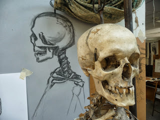
Studies drawn with the help of my constant A Level companion, George the Skeleton.

Through my studies of skeletons I became very confident with the medium of charcoal and found myself ready to begin some animation tests using Kentridge's method.


My first ever animation test using Kentridge's method. Clearly I needed a better tripod!

Learning my lessons from the mistakes in my first test, I began to get more ambitious, with a life-size drawing of a skeleton. Not making it move yet though - that's the next step!


I'm not one to sit still when something needs to be done so next I was straight on to my first ever proper animation! I drew a 6ft tall skeleton with charcoal attached to the end of a metre-long piece of bamboo (a-la Matisse) and made it do a walk cycle! Each drawing took approximately 4-6 hours, so whenever I feel frustrated at the slow pace of the animations I do nowadays, I just remind myself of this little project and thank heavens it's over!

Please enjoy my first ever walk cycle. It may not be perfect but I shall always be proud of it! The ghostly effect is created by rubbing out each pose after it has been shot and drawing the new pose on top.


All of these skeleton drawings have really helped me with anatomy, which is of course of paramount importance to animation, and I'm happy to say that I have also improved a lot in the last two years!

Skeleton studies from April 2013

Finally before I end this post, here are some close-ups of the drawings seen above with their skeleton model.


Until next time!


Monday, 28 October 2013

Animation Timeline

I was talking to the first years today about their projects. They've just done one of my favourite projects from last year; a flag flying! When we were given the brief we all thought at first that it would be nigh impossible but it turned out to be one of my all-time favourite projects.


This wasn't included on my showreel for the Glammies because I was told to make that using the work I did in later projects, but as I say it remains one of my favourite projects.

Another project that I would like to share with you is my character animation piece from last year. Both the trait and the performance made it into my showreel however as that was fairly jam-packed, I don't know if you had time to properly see them.


I designed the character from scratch and my coursemates affectionately named her 'Julia Old'. The trait is my absolute favourite as having a kung-fu granny (I think) is pretty darn cool! My older brother provided me with video reference of him doing the kick as he's very good at martial arts.

The last two pieces I want to share with you are from before I even started university. In the summer of 2011 I had a week's work experience with Hibbert Ralph Animation in London.  I was so grateful for the opportunity!

The first tasks they set for me involved a bouncing ball. The first exercise was to have it bounce across the screen, then in perspective and finally in a room smashing things up!


As HRA mainly specialises in advertising, my last challenge was to create an advert about fruit. Where to start, eh? Well, after lots of drawings of various types of fruit, I came up with a pun around the words 'peeling' and 'pealing' and went with it.


Here's looking forward to future animation! I'm in the process of scripting out the film that I'll make as my major project this year and looking forward to learning flash in the coming weeks.

Have a good week everyone!

Monday, 21 October 2013

2nd Year has Begun!

Summer holidays go so fast! I blinked and now I'm beginning my second year at University! It feels good to be back to work and better still to be with my coursemates again. We had a brilliant year last year and I was incredibly honoured to be nominated for the 'Most Promising First Year' award at our end-of-year awards ceremony, the Glammies.

To see all of the fantastic work shown at the Glammies, go to the website --> The Glammies

Below is a link to my first year Showreel, shown at the ceremony; a collection of my favourite animations from last year. Spot Julia Old in there! Named by my friends, she's a gem and, unfortunately for me, the name has stuck!


Monday, 14 October 2013

Glammies Stings

At the very end of our first year of uni, we were given our first piece of collaborative animation work - to create short stings to introduce each of the categories at the Glammies show. The theme was 'Western' and we were given 2 weeks to create a sting within our groups. I worked with CiprianBethan, Yaw and Ryan and we, being full of ideas, made two stings! Our first pieces of coloured, collaborative animation work! I hope you enjoy them!


Until my next post!

Monday, 7 October 2013

Norman McLaren

This summer I discovered the works of the animator Norman McLaren. He was born in Scotland in 1914, spent most of his film career in Canada and died in 1987 in Montreal. Working for the National Film Board of Canada, he made many, many films using different media and in different styles. Some of his animations were etched straight onto film with no narrative and made to synchronise with music while others were narrative pieces involving live action.

I discovered McLaren's work by happening on an app for my iPad. 51 films, an essay and biography by Donald McWilliams later, I'm a fan. I've also been experimenting with the three workshops available on the app - paper cut-out animation, etching on film and synthetic sound. I've been enjoying it immensely and would recommend it for all. (Also, the app is free so no excuse not to play!)

My favourite film of his has got to be 'Pas de Deux'. The technique of 'live action with optical multiplication of imagery' creates a beautiful effect and the way the figures are silhouetted makes the dance very ghostly and graceful. I highly recommend watching the film. Whether you are an animator, a filmmaker, an enthusiast or just looking for something to do for 13 minutes, you will not be wasting your time.


"McLaren once said, 'Almost all of my films start with a curiosity about technique.' ... There was often a long gestation period between the technical curiosity and it's arrival in a film. The idea for 'Pas de Deux' was planted in Paris in 1951 when McLaren saw a cinema commercial for women's corsets. The images were multiplied. McLaren put that idea in his subconscious as an exciting technical possibility, and it would emerge in 1967 as 'Pas de Deux'." - extract from the essay 'Norman McLaren: A Filmmaker for All Seasons' by Donald McWilliams


I've been enjoying drawing from stills of the film. In animation, you need to draw the forms and 'see in the round' but drawing from this has been a wonderful opportunity to use other techniques; just drawing the shapes the light makes instead of seeing 'in the round' and drawing on mid-toned paper with a white pencil rather than the usual white paper and dark pencil have been liberating.


Dancers in general are wonderful to draw because of their grace and the lines they make with their bodies. If there were ever a figure where the 'line of action' is clear as day, it's a dancer.


"Animation is not the art of drawings-that-move, but rather the art of movements-that-are-drawn. What happens between each frame is more important than what happens on each frame. Therefore animation is the are of manipulating the invisible interstices between frames."
-Norman McLaren


I hope you enjoy the film and like my drawings. Until my next post!